


The Bitcoin Rainbow Chart has just given an indication of “accumulate”. This means that people who believe the chart is a good indicator of the future Bitcoin (BTC) price could buy Bitcoin now. But what is the chart? And what is its significance?
What is the The Bitcoin Rainbow Chart?
The Bitcoin Rainbow Chart is a visual representation of the historical performance of Bitcoin. The chart plots the price of BTC movements via colored bands.
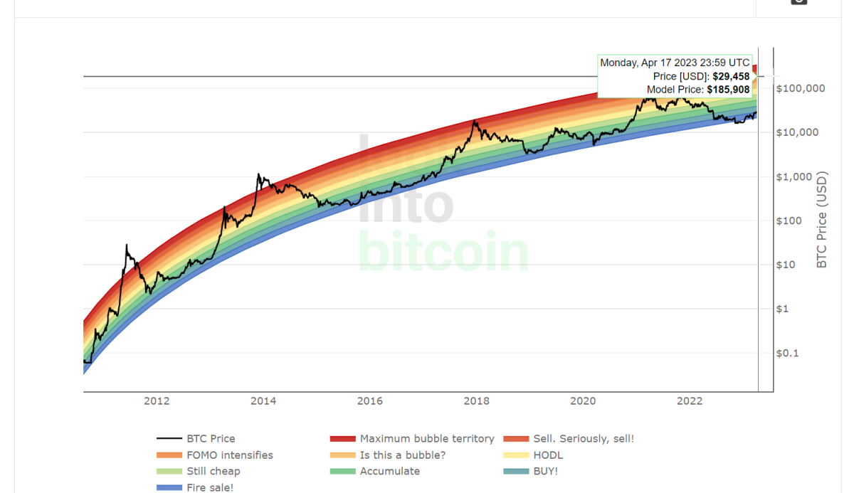
Each band represents a different level of Bitcoin’s market cycle. The bands range from the start of a bear market (where the market is down, or hibernating like a bear) to the peak of a bull market (charging forth like a bull). Generally speaking, the chart provides a rough estimate of where Bitcoin’s price might be heading next.
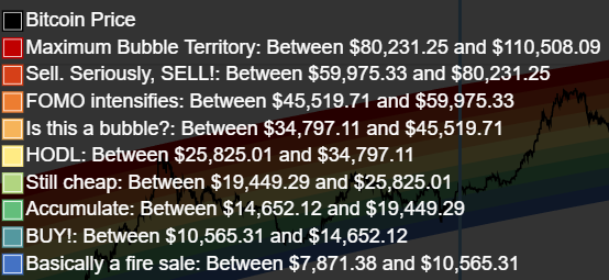
Here is what each colour means:
The chart is designed to help traders and investors make informed decisions about buying and selling Bitcoin based on its historical price trends.
The rainbow chart has been around since around 2014, so it was there in the early days. And over time, its predictions have not been too far off.
As Bitcoin gets more adopted and its market cap increases, we see the curve slowly flatten out over time as the asset class matures.
Accumulate phase
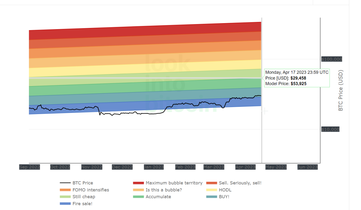
The Bitcoin price is currently sitting around US$30,000 (AU$44,590.65), so we are in the accumulation zone.
If the Rainbow Chart follows earlier patterns, then by the end of the year, the price of BTC could end up in the red region, which is the ‘Maximum Bubble Territory’.
This happened in 2017 when Bitcoin went into the ‘Accumulate’ phase in May, and then was into the ‘Maximum Bubble Territory’ in by December.
Average prices of Bitcoin per month in 2017
January 2017: $972.33
February 2017: $1,068.44
March 2017: $1,123.78
April 2017: $1,251.94
May 2017: $1,866.65 (Accumulate Phase)
June 2017: $2,594.91
July 2017: $2,515.90
August 2017: $4,357.67
September 2017: $4,043.09
October 2017: $5,514.44
November 2017: $8,107.45
December 2017: $14,416.40 (Maximum Bubble Territory)
Bitcoin Rainbow Chart: What will happen this year?
As for 2023, if the Rainbow Chart is to be believed, the price could be between $152,000 and $210,000. This will put the price deep into the ‘Maximum Bubble Territory.’ If the price hits this territory, then it will probably be time to sell.
The thing to remember though, is just because Bitcoin hit the “accumulate” phase in previous years, and then went into maximum bubble territory, doesn’t mean that it will do that again in 2023.
The Rainbow Chart is not a perfect predictor of BTC’s future price performance. There are many things that can affect the BTC price, such as wars, regulation changes, and recessions. And we never know what is coming around the corner.
But for now, the Rainbow Chart is a very interesting tool to get to know.